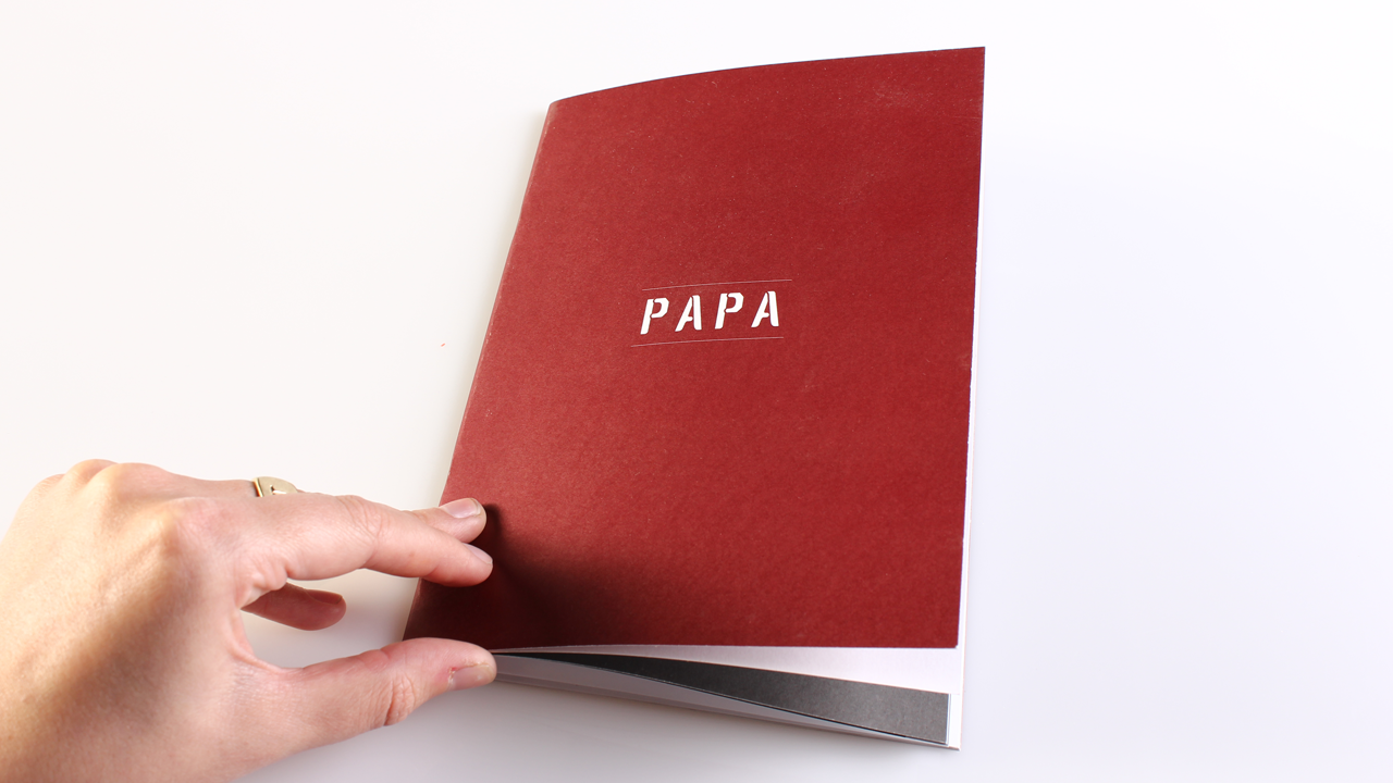
Papa — Alphabet Design
An experimental alphabet I designed based on human characteristics. My dad was the case point – using his military background and personality as the basis for the inspiration. I came up with the principle of him being, hard on the outside but soft on the inside which gave me an angle to build the letterforms. The stencil came from looking at various military paraphernalia, this has been digitized but also made as a physical stencil font which is housed in an old ammunition tin.


